project //
Eunuverse Typeface
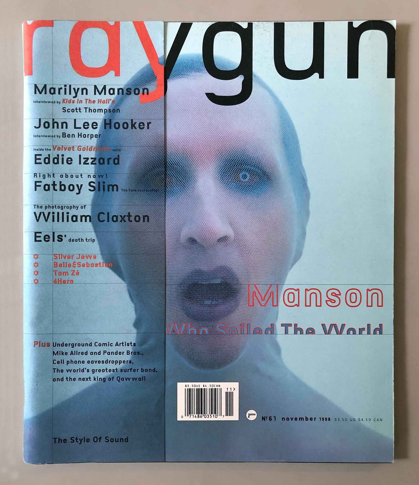
In 1997, before Eunuverse existed, I arrived in Santa Monica, California, to begin a redesign of Raygun Magazine. Warren Corbitt was there, having joined me to work on the redesign for the summer between his two years at Cranbrook. On the first day, we drove around L.A., ate tacos, drank margaritas, and decided we needed a new font.
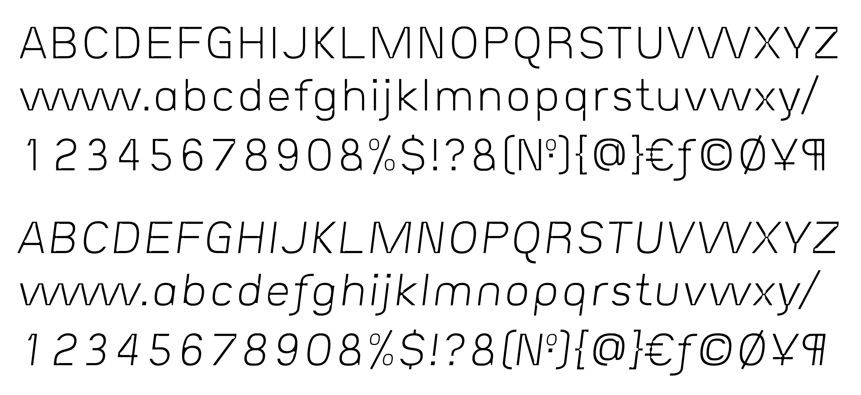
The Light Weight
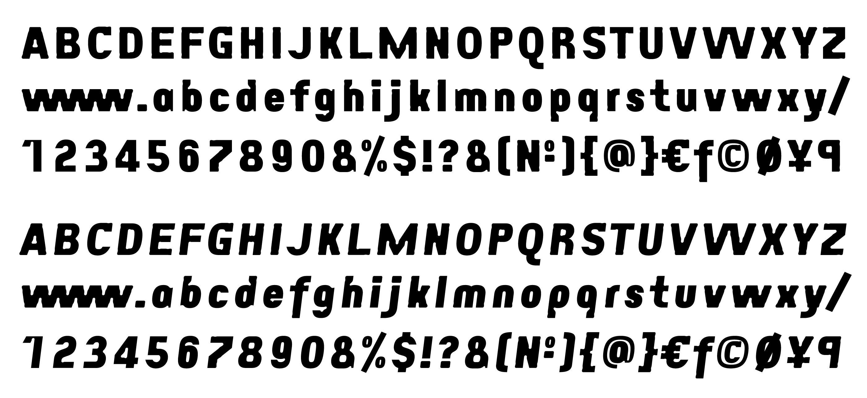
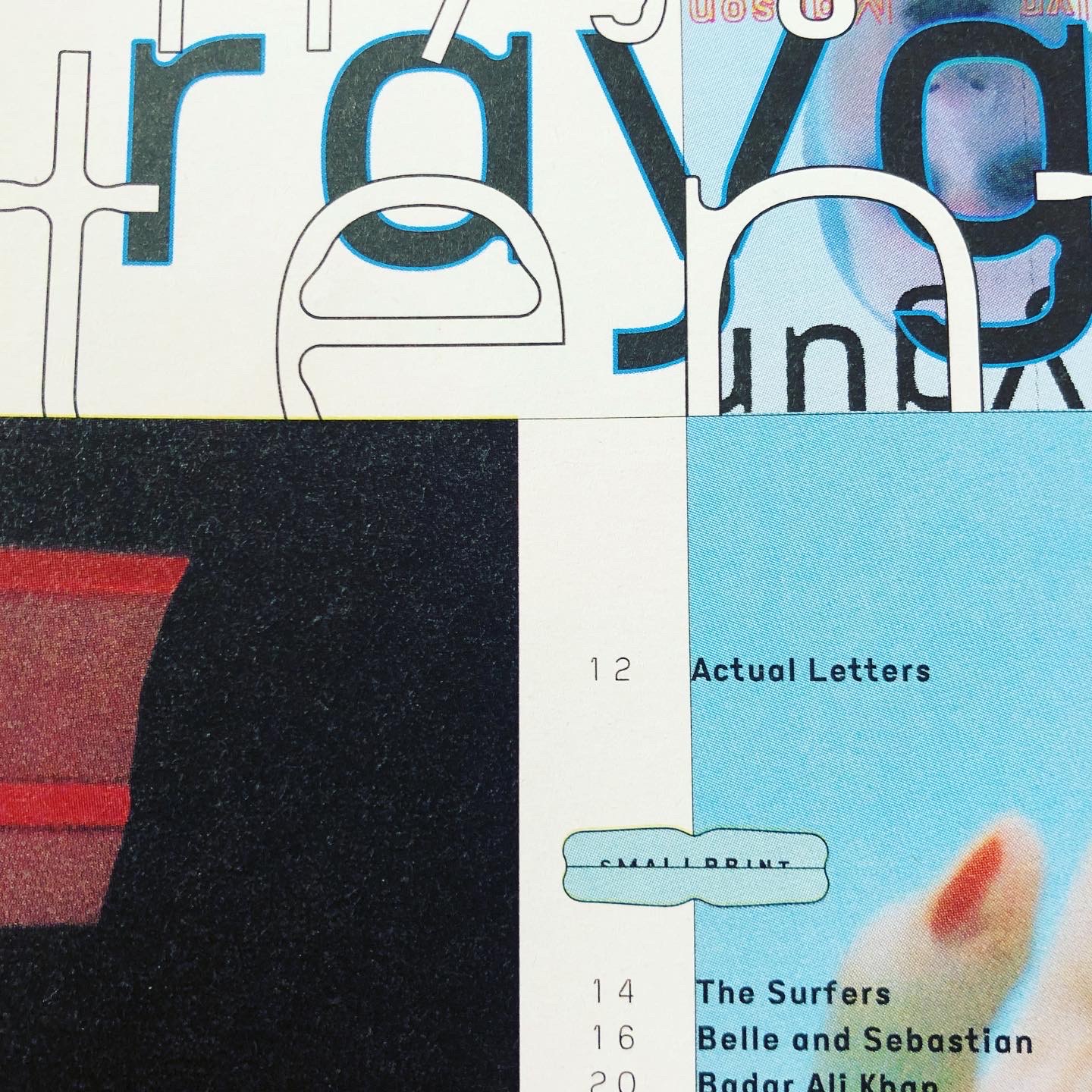
I began working on Eunuverse the next day, and we designed our first issue (#59, with Prodigy on the cover) while I was working on the font. Due to time constraints, that first issue was all set in one weight, a very light one that I called “Regular” because it was the only weight we had. I also made the letters smaller than normal in the em square to make it easier to defend small point sizes to our overlords at the magazine.
In time for the next issue (#60, with Kiss on the cover) I designed the weight I called bold. I skipped over all the possible intermediate weights — maybe I’ll fill in that noticeable gap someday — and went straight to Bold. It was nice to have more than one weight. We rejoiced.
Extra Bold
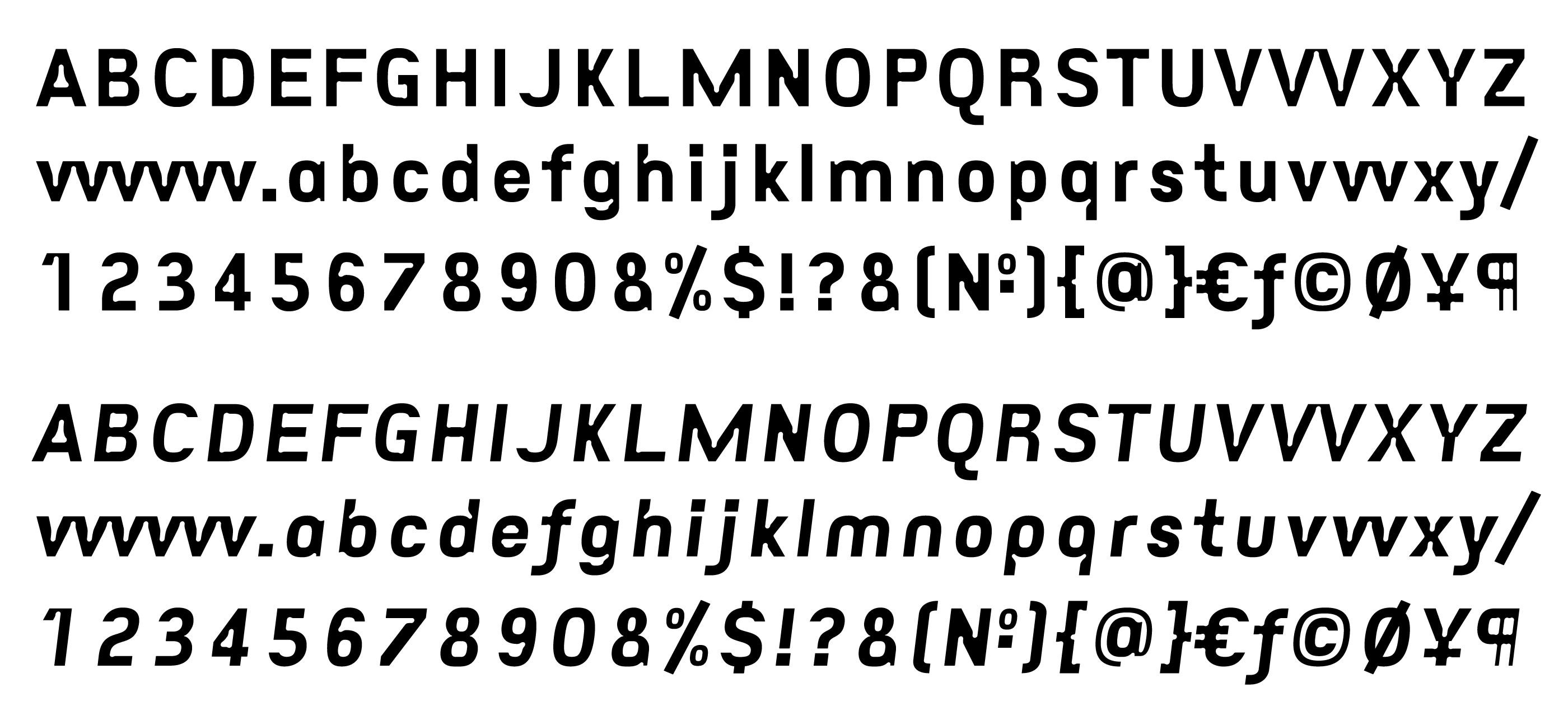
I don’t remember whether I had wanted us to have a third weight; was I just procrastinating? Somehow, the final weight doesn’t show up until issue #63, the one with Fatboy Slim on the cover, a fat face for Fatboy Slim.
As a decorative gesture, I carved out some curvy slices from the stems and referred to them as “negative serifs,” an idea too ridiculous to ever catch on. Because of this, it’s more like another style than a weight. I wonder if I unconsciously felt the pressure of our commitment to using only Eunuverse* — combined with the market necessity for magazine designs to evolve.
Not Universe, Eunuverse!
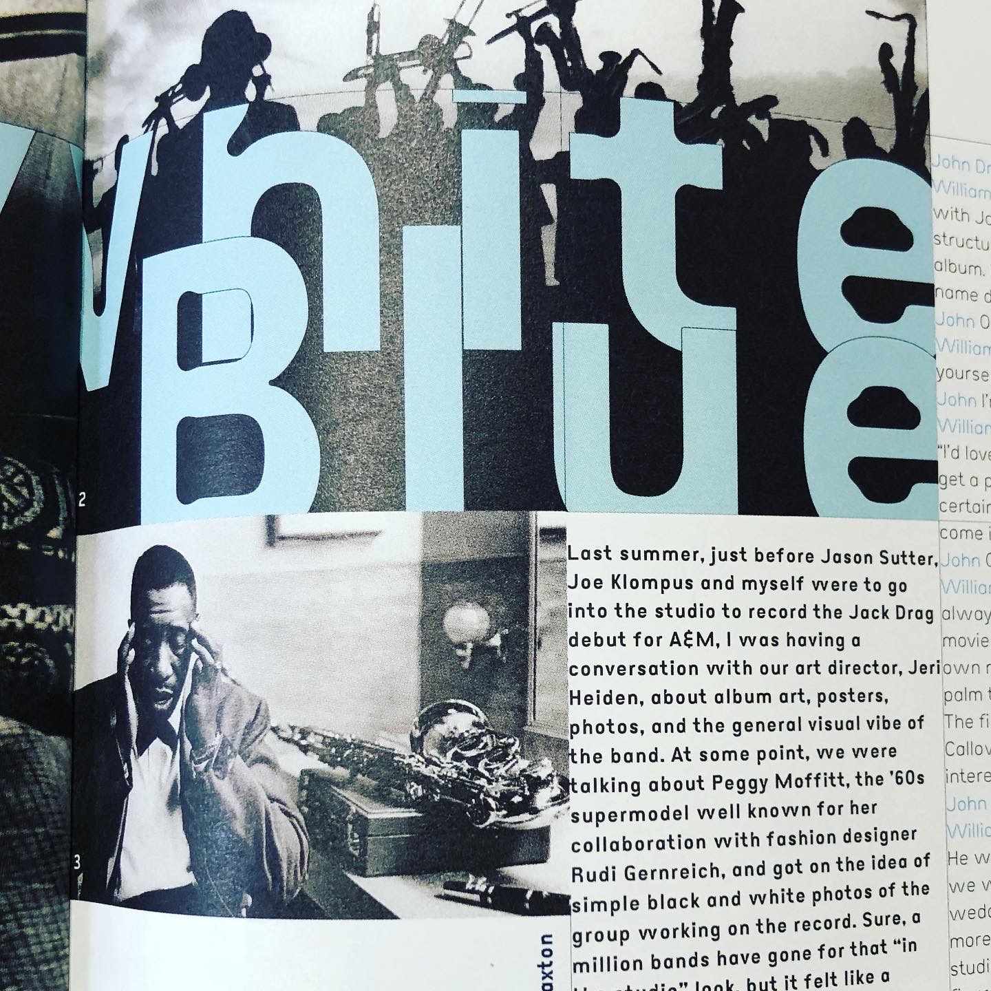
The name, Eunuverse, is pronounced: “Universe,” and I wouldn’t recommend such naming practices. It’s a name that can’t be spoken without explaining or clarifying, and you end up sounding stupid and tedious. The “eunu” part was from “eunuch.” Ever-fond of finding links between type and sex — Eric Gill was reputed to have had bestial relations with his dog, for instance, and I had made my M.F.A. thesis all about such things — Eunuverse’s ink traps made the font look to me “as if every crotch had a bite taken out it.” Silliness aside, Eunuverse became a practical font for our designs, a basic sans-serif with some lovely little quirks.
Eunuverse was distributed by Thirstype, which became Village.
*except for Warren’s gratuitous use of a font called Orgasm on the cover of issue #60
includes //
Eunuverse Roman | 1997
Eunuverse Bold | 1997
Eunuverse Extra Bold | 1997
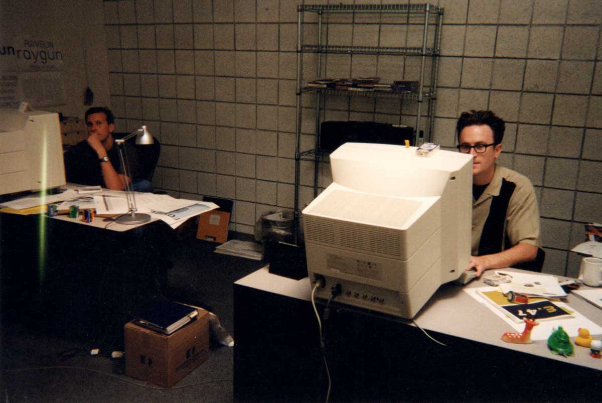
Designing Raygun | 1997 | Warren Corbitt in the forground, me lurking in the dark corner. What chunky monitors we had!