
project //
Old Posters
This is a sampling of posters I created between 1987 and 1992, at CalArts (California Institute of the Arts) and later in Chicago. Silk-screened posters were usually done in the wee hours. I remember going to bed one time for an hour before our graduate seminar, only to have my dreams dominated by cinematic, close-up images of ink sloshing through the screen. While printing posters for my thesis project, I ran into a wall in the darkroom and acquired a neat little gash in the middle of my forehead.
Later on, I continued augmenting my graphic design with other skills. My typeface designs, my photos, my illustrations, and more recently, my source code — sometimes for economy’s sake, other times because I wanted it that way.
includes //
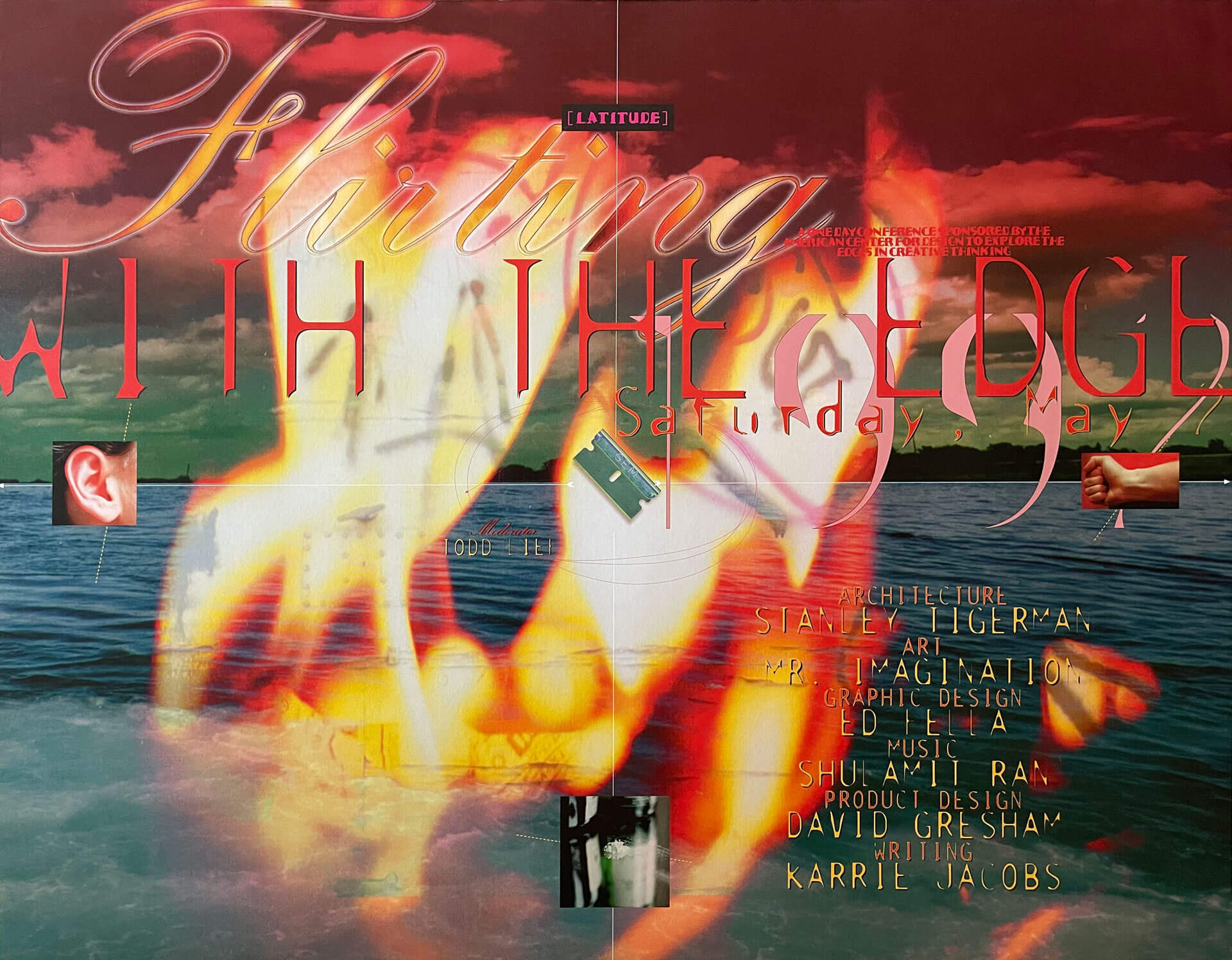
Flirting With the Edge conference poster, 1992 | Created with Adobe Photoshop, Aldus Freehand, and Quark Xpress, this poster included my design, as well as photography, photomontage, and original typefaces.
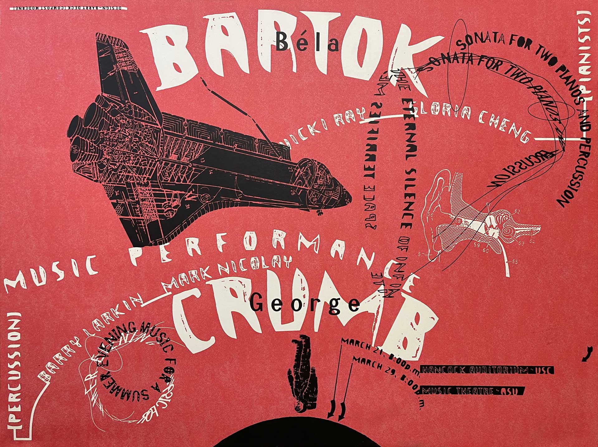
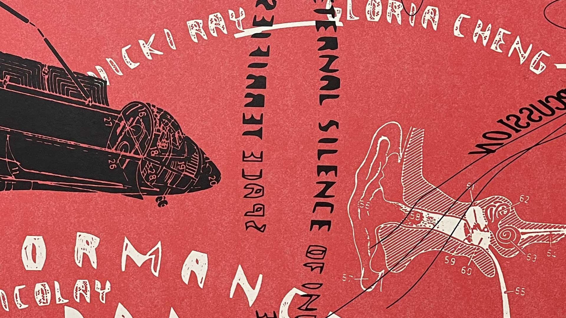
Bartok-Crumb recital poster, silk screen print, 1988 | Made using letterforms degraded by the early autotrace and deform functions in Aldus Freehand and appropriated visual dictionary illustrations, it depicted a world of modern technology gone awry.
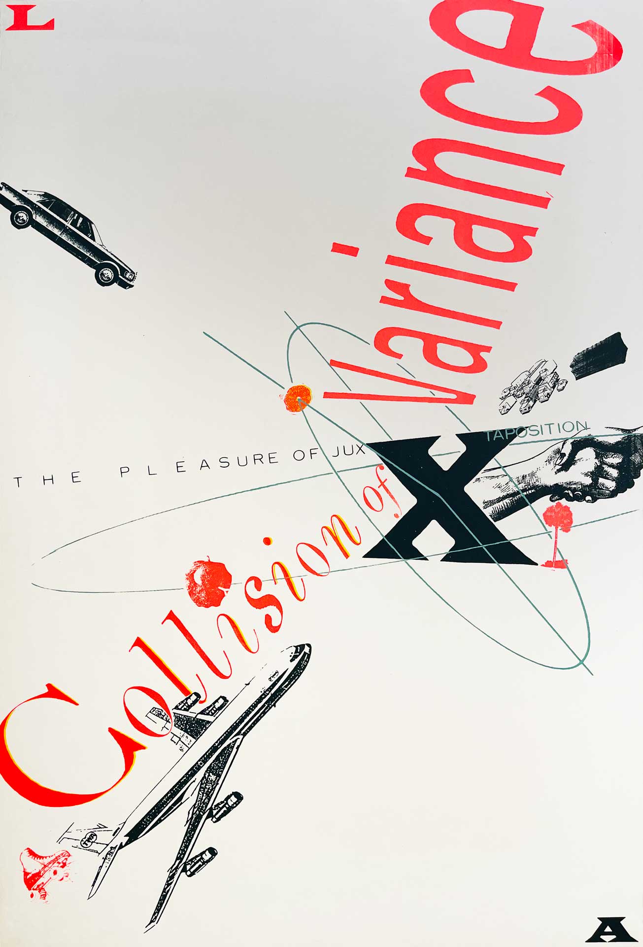
Collision of Variance poster, 1987 | Silk Screen Print | First time I was consciously under the influence of Ed Fella.
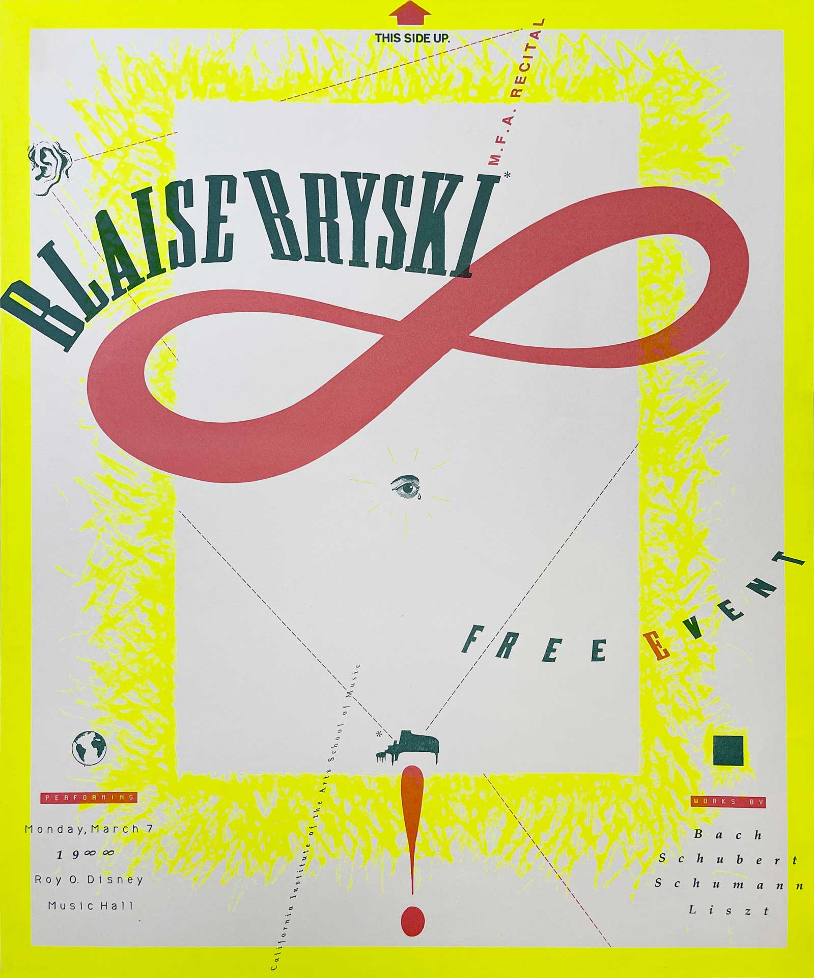
Blaise Bryski recital poster, 1988 | Silk Screen Print | Reviewing this in a desk crit, Mr. Keedy told me I had discovered meaning.
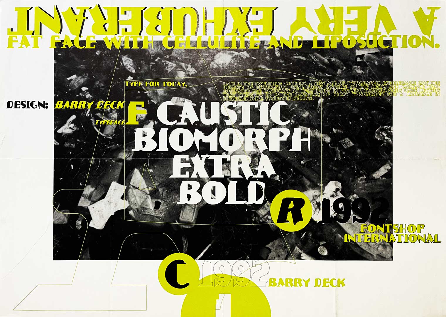
Caustic Biomorph Poster, 1992 | Way back before I learned how to spell exuberant, I made this poster for the release of a typeface I designed as part of Neville Brody’s Fuse project, it’s a “fat face,” but eroded with added cellulite and selective liposuction.
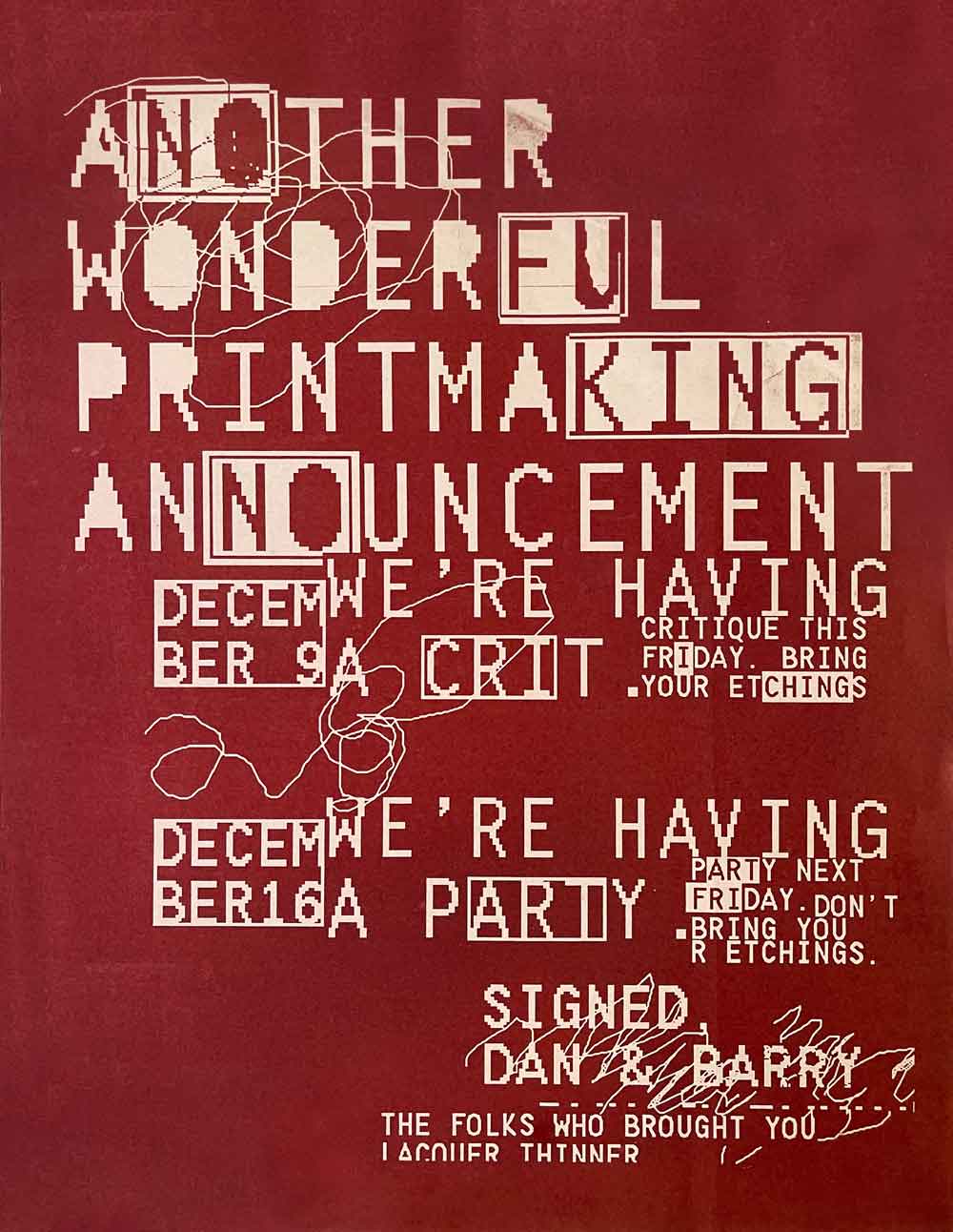
Printmaking Party & Crit Poster, Diazo Print, 1987 | Created in MacPaint using the bitmap version of the Letter Gothic Bold font, and governed by the fully-destructive, one-layer editing logic of the early software. Many of the highlighted fragments of the text reveal additional messaging, adding inflection to the main text.