
project //
Template Gothic
I started designing Template Gothic in 1989. I wanted to use a typeface like that, and there wasn’t one. My mentor at CalArts, Ed Fella, had explored all kinds of vernacular, including lettering templates. We had conversations about bringing the vernacular into graphic design. It’s what we were talking about at CalArts back then. Sort of a zeitgeisty thing. A girl I liked was designing something with at least one template-drawn letter in it, a capital “A.” I began with a similar “A.” I finished the first character set the way I always did back then, hurrying to finish all the letters so that I could use the font.
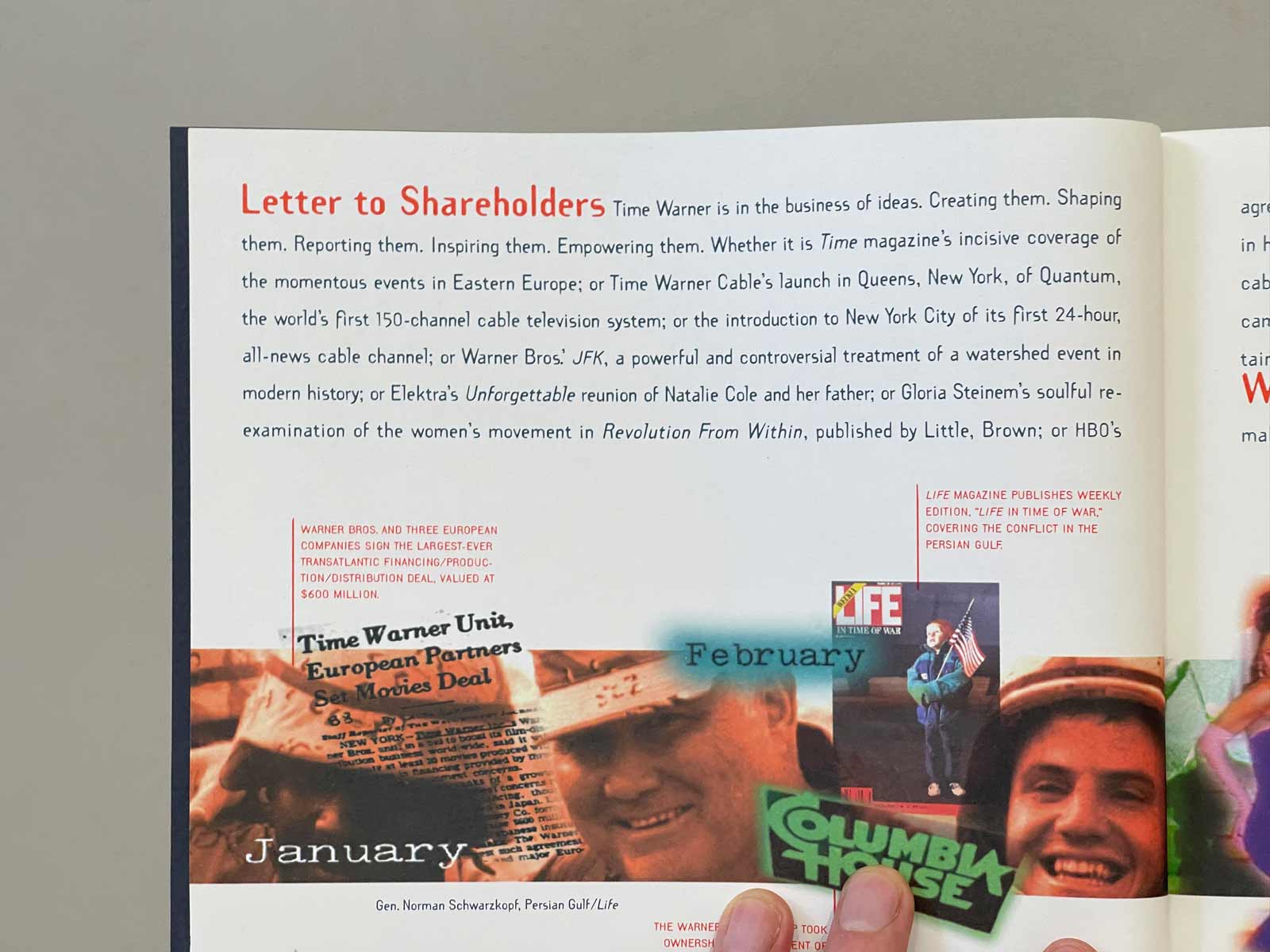
I kept tinkering with it though and revised it many times after the first year before Mr. Keedy told Rudy at Emigre about my fonts and Template Gothic began to get some publicity. In 1991, Emigre released the Template Gothic fonts (there was a bold weight by then) and Rudy used the font for every word of Emigre issue #19. One year later, TimeWarner’s Frankfurt Gips Balkind-designed annual report would drop, with all headlines and text—even the financials—set in Template Gothic.
Along with 22 other fonts, Template Gothic was acquired by the Museum of Modern Art in New York as part of its Architecture and Design Collection in 2011. It was displayed in MoMa’s Standard Deviations exhibition from March 2011 to January 2012.
Where to Find Template Gothic
Anyone who wants to use Template Gothic can buy it at Emigre or activate it in the Adobe Type Library. Below, I’ve added a selection of designs that used Template Gothic.
includes //
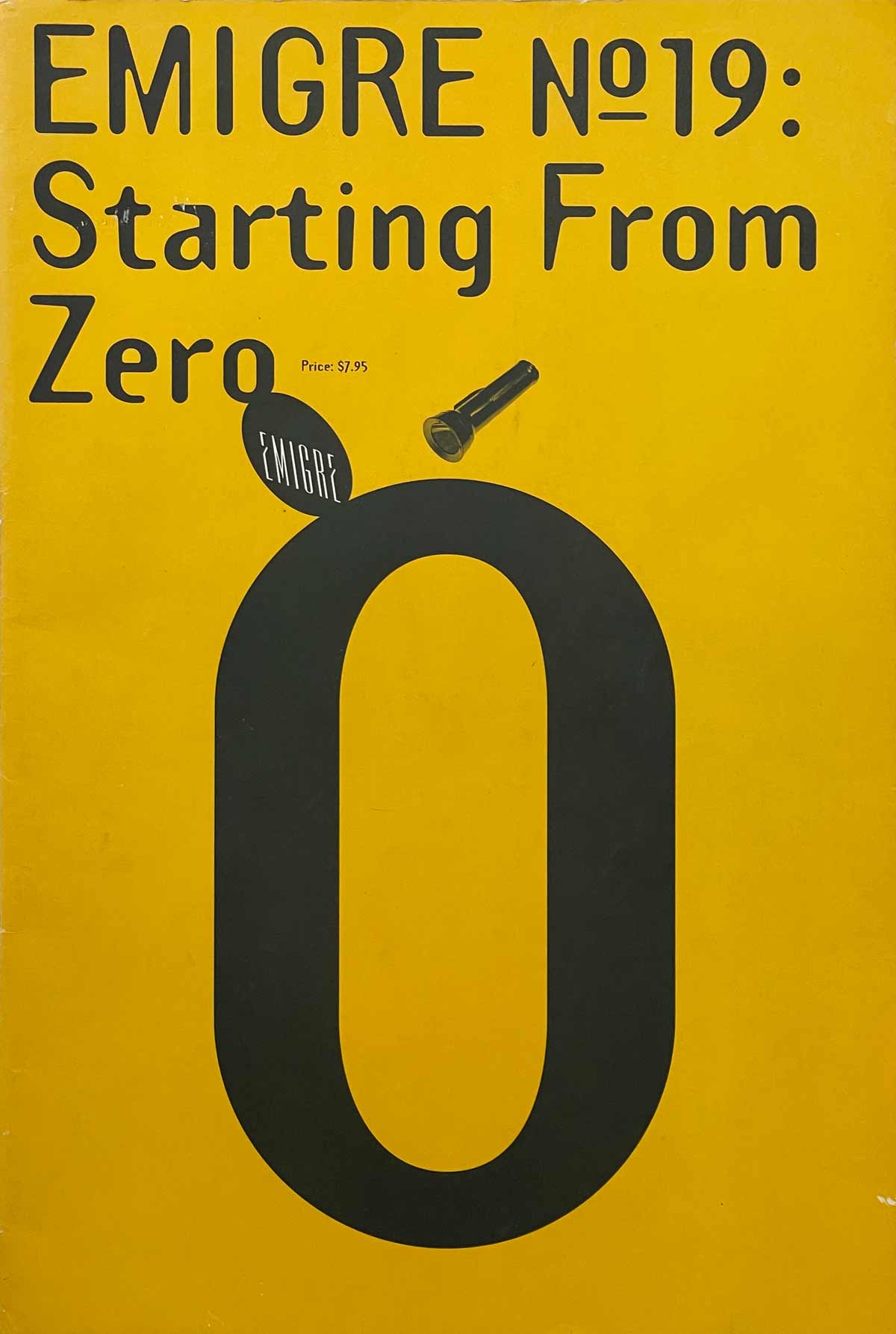
Emigre Magazine #19: Starting From Zero | 1991 | Designed by Rudy Vanderlans
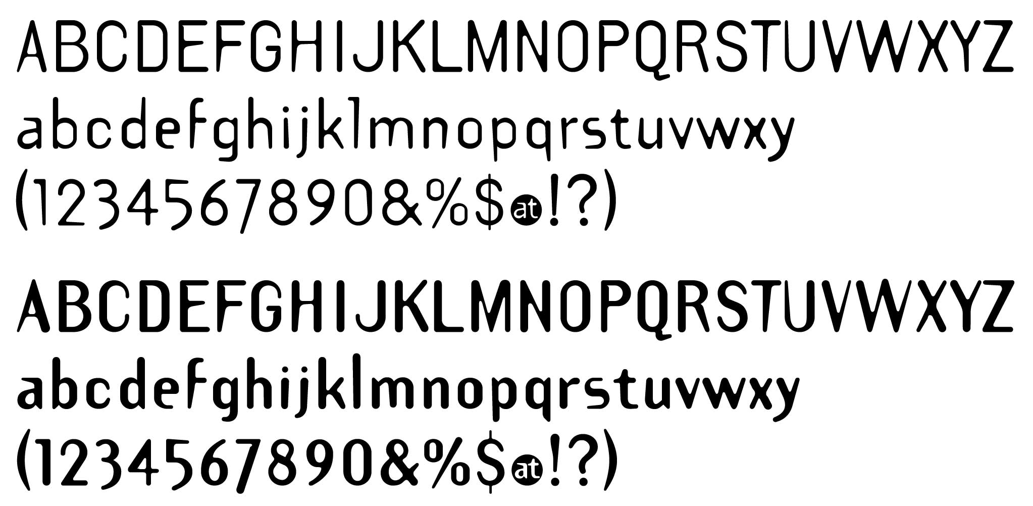
Partial Glyphset | 1991
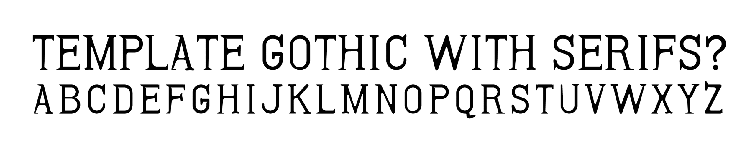
Template Gothic Serif Experiment | 1993
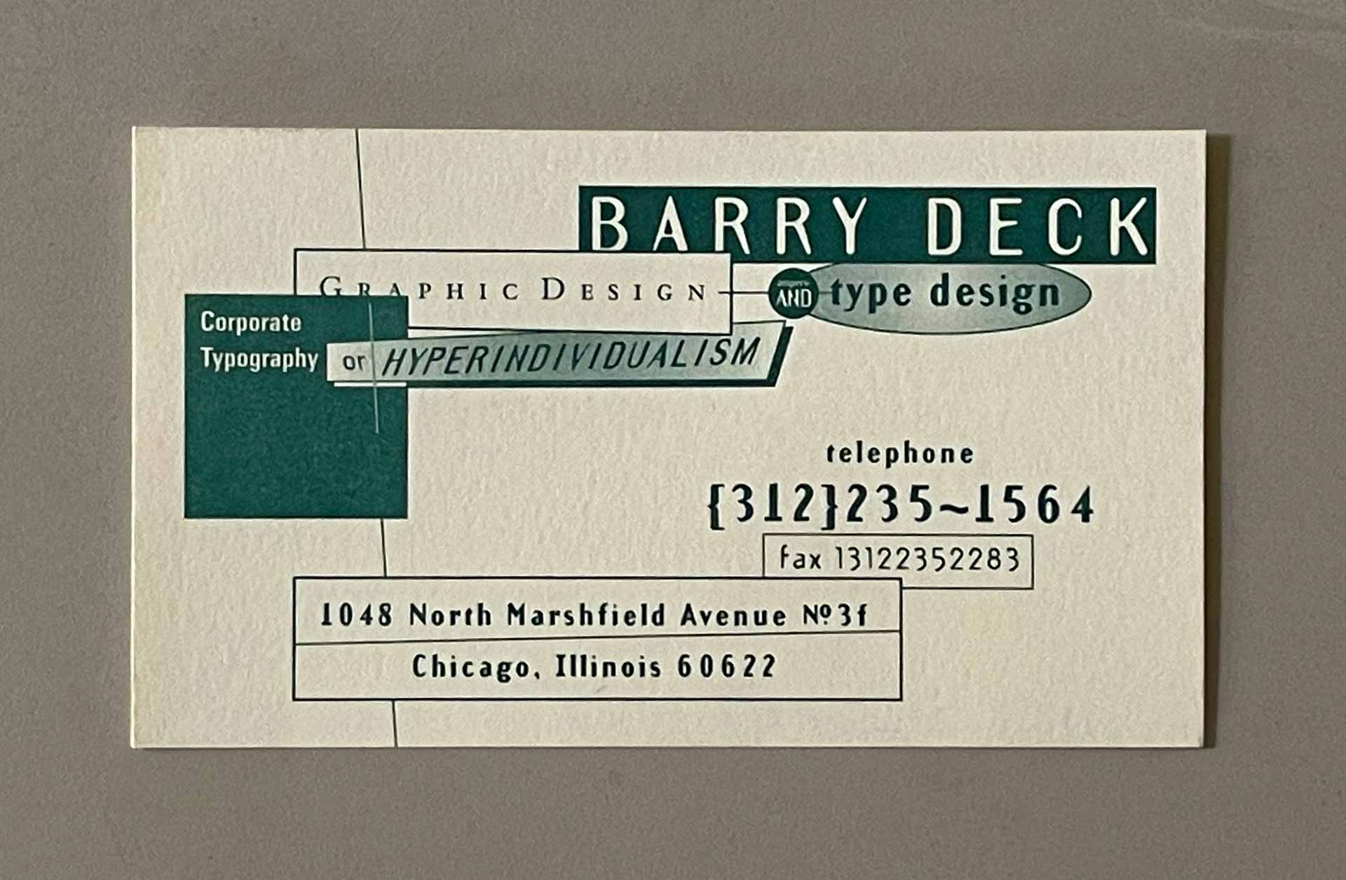
Business Card | 1991 | Corporate Typography or HYPERINDIVIDUALISM
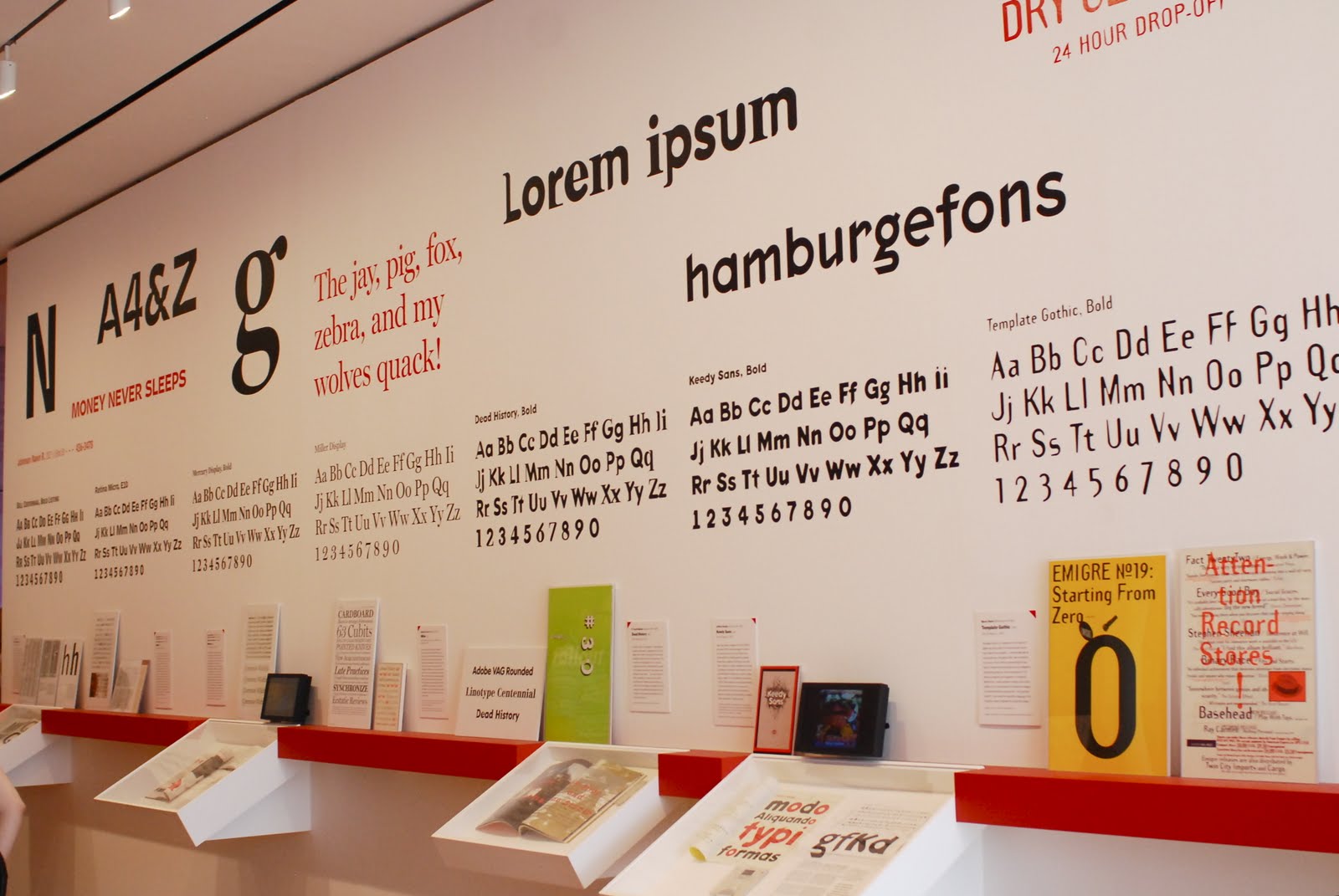
Standard Deviations Exhibit, MoMA | 2011 | Template Gothic, (foreground) appeared in this exhibit of digital typography at the Museum of Modern Art in New York. The typefaces in the exhibit constituted the museum’s first acquisition of digital typefaces and were added to the permanent collection.
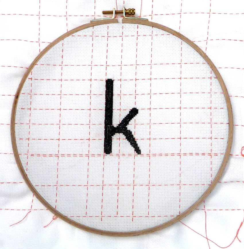
Embroidered “k,” Tuija Tarkiainen | 2014 | In a project called Typestitch, Tuija embroidered a letterform from each of the 23 digital typefaces in MoMA’s 2011 exhibit.

TimeWarner Annual Report | 1991 | Designed by Frankfurt Gips Balkind, every word was set in Template Gothic.
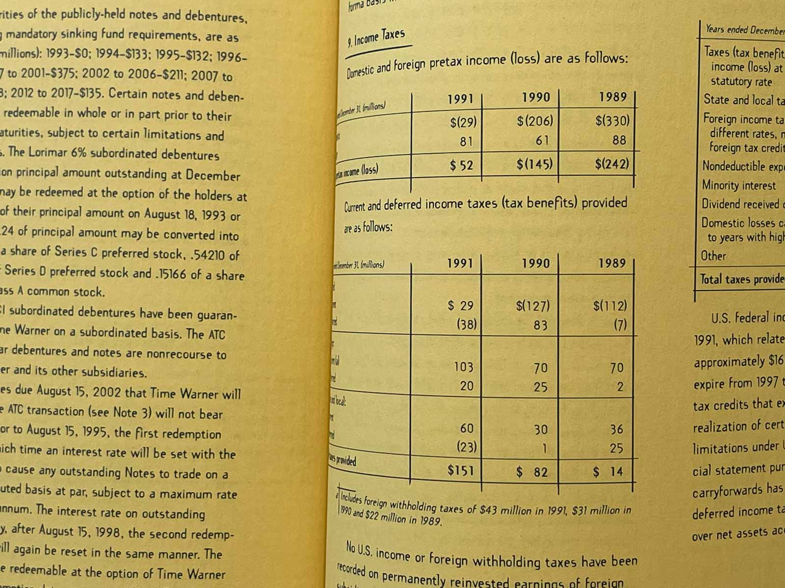
TimeWarner Annual Report | 1991 | Financials
TimeWarner Annual Report | 1991
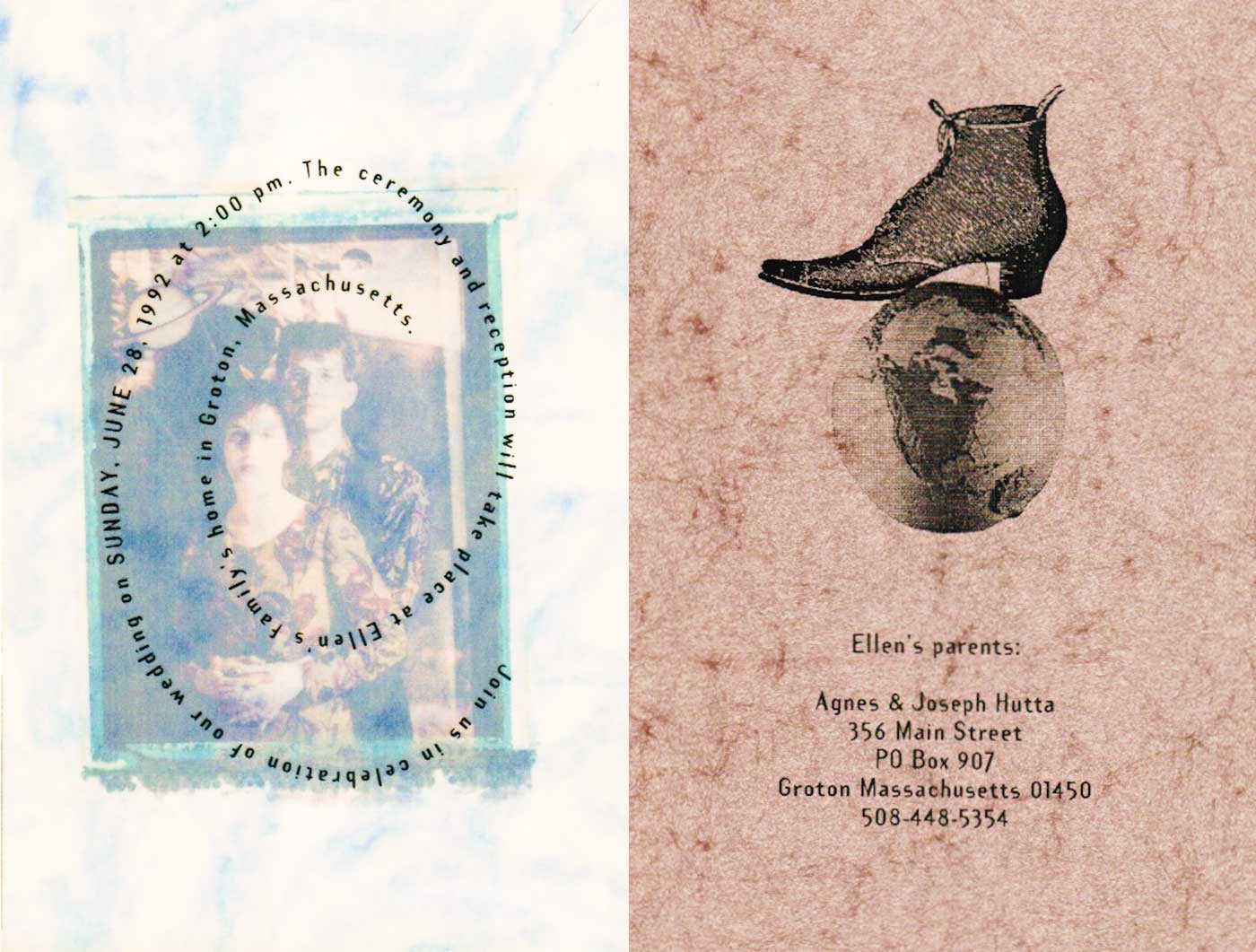
Wedding Invitation | 1992 | Ellen Hutta-Fitzgerald & Kenneth Fitzgerald
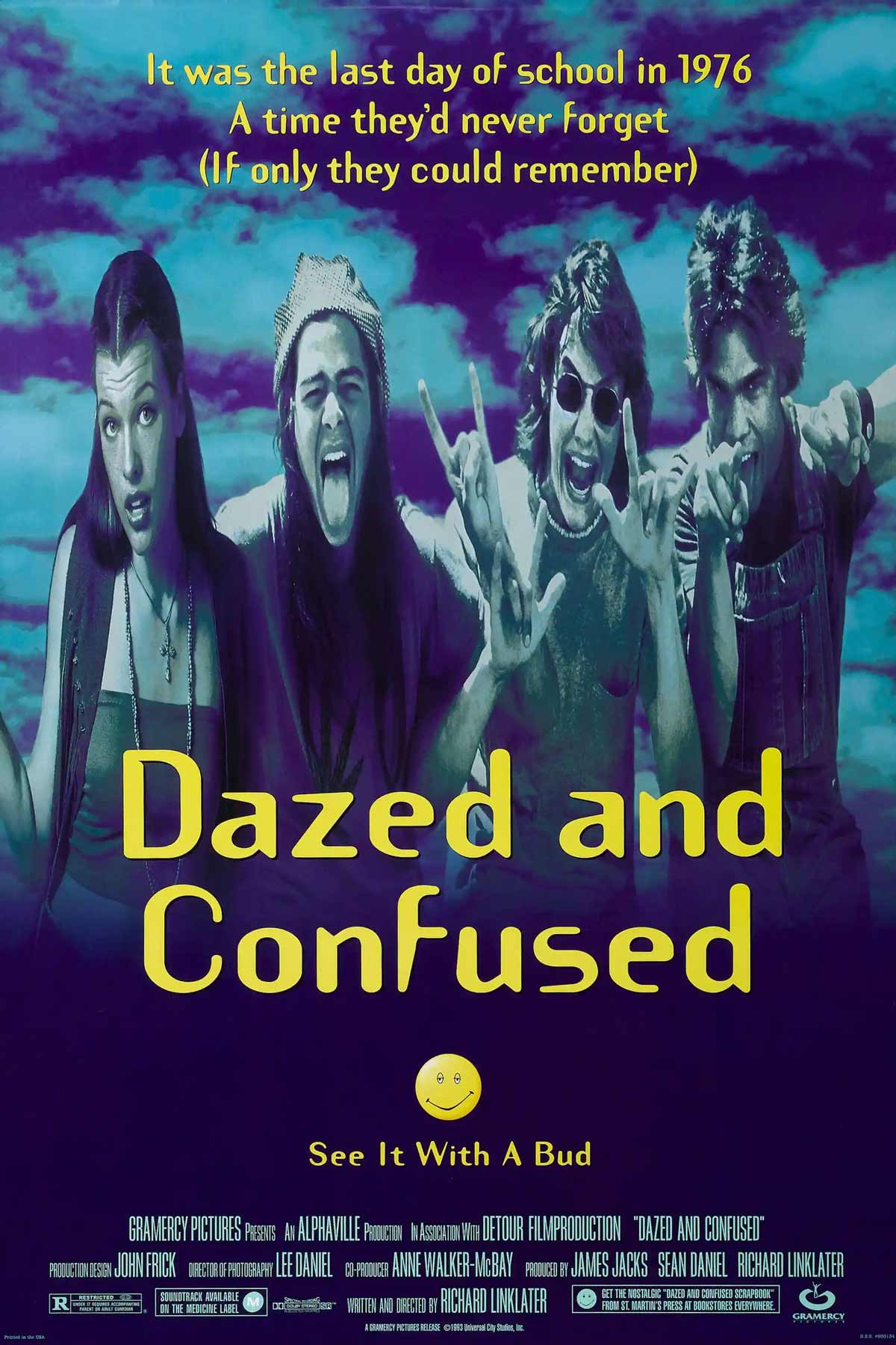
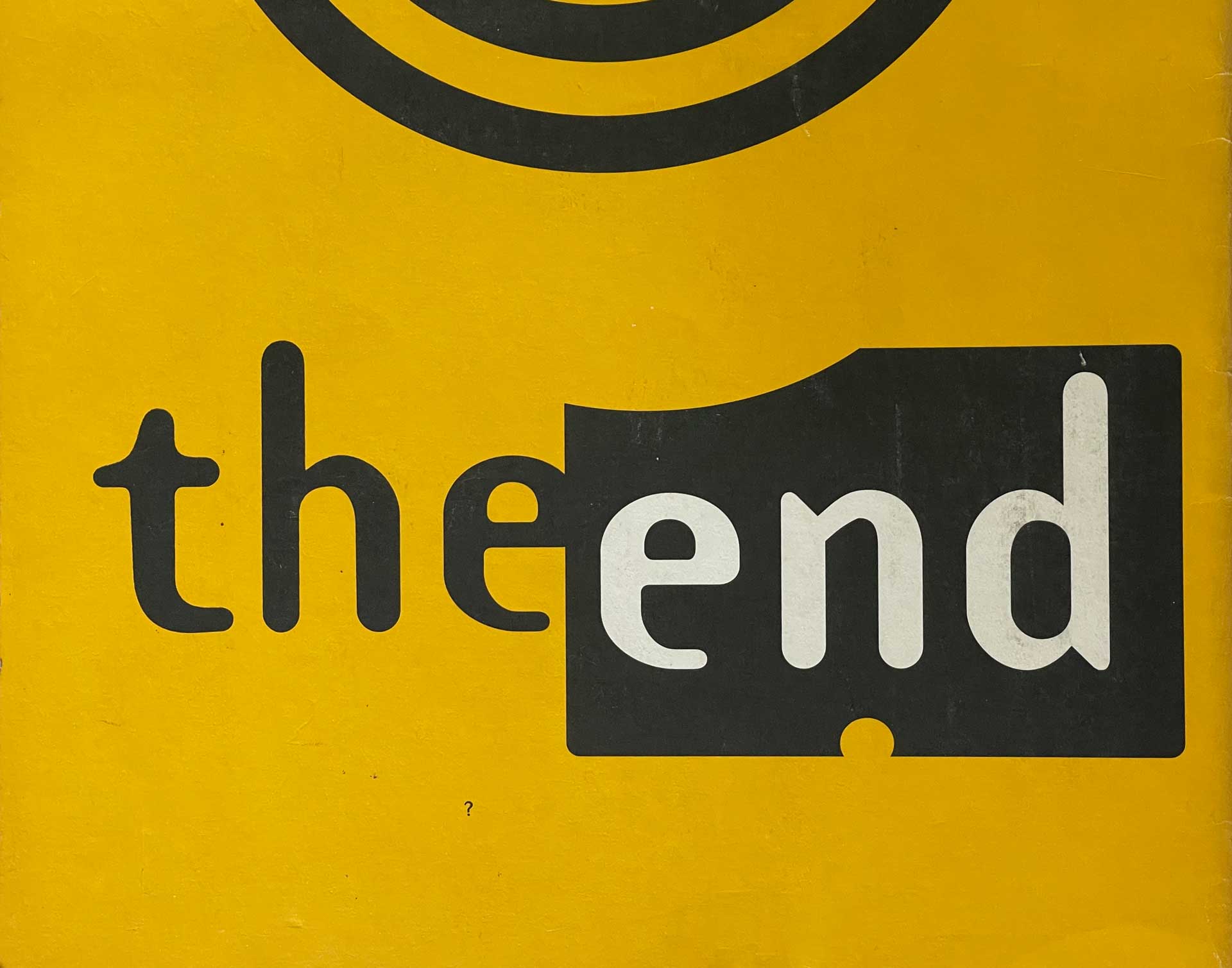
Movie Poster | Dazed and Confused | Designer unknown.
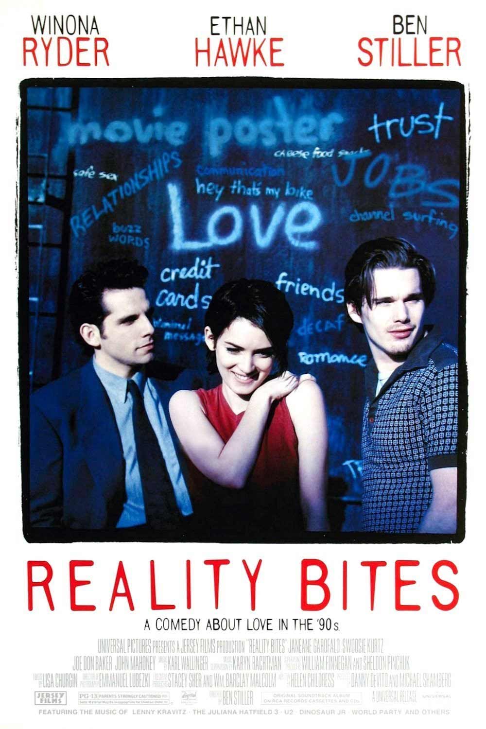
Movie Poster | Reality Bites | Designer unknown.
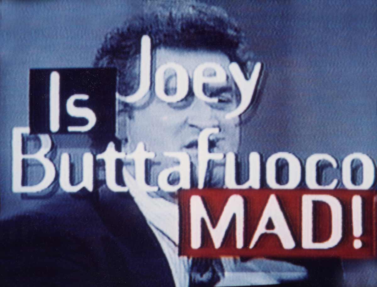
Channel 4 New York Promo | 1992 | Designer unknown. Joey Buttafuoco mad.